UX DESIGN HIGHLIGHTS: ARTWALK
ABOUT
The original objective was to take an existing design and improve it.
APPROACH
I couldn’t find a current art walk app so I set out to design one. By pulling together examples from local art walks and their websites, I created the content...
BRAND
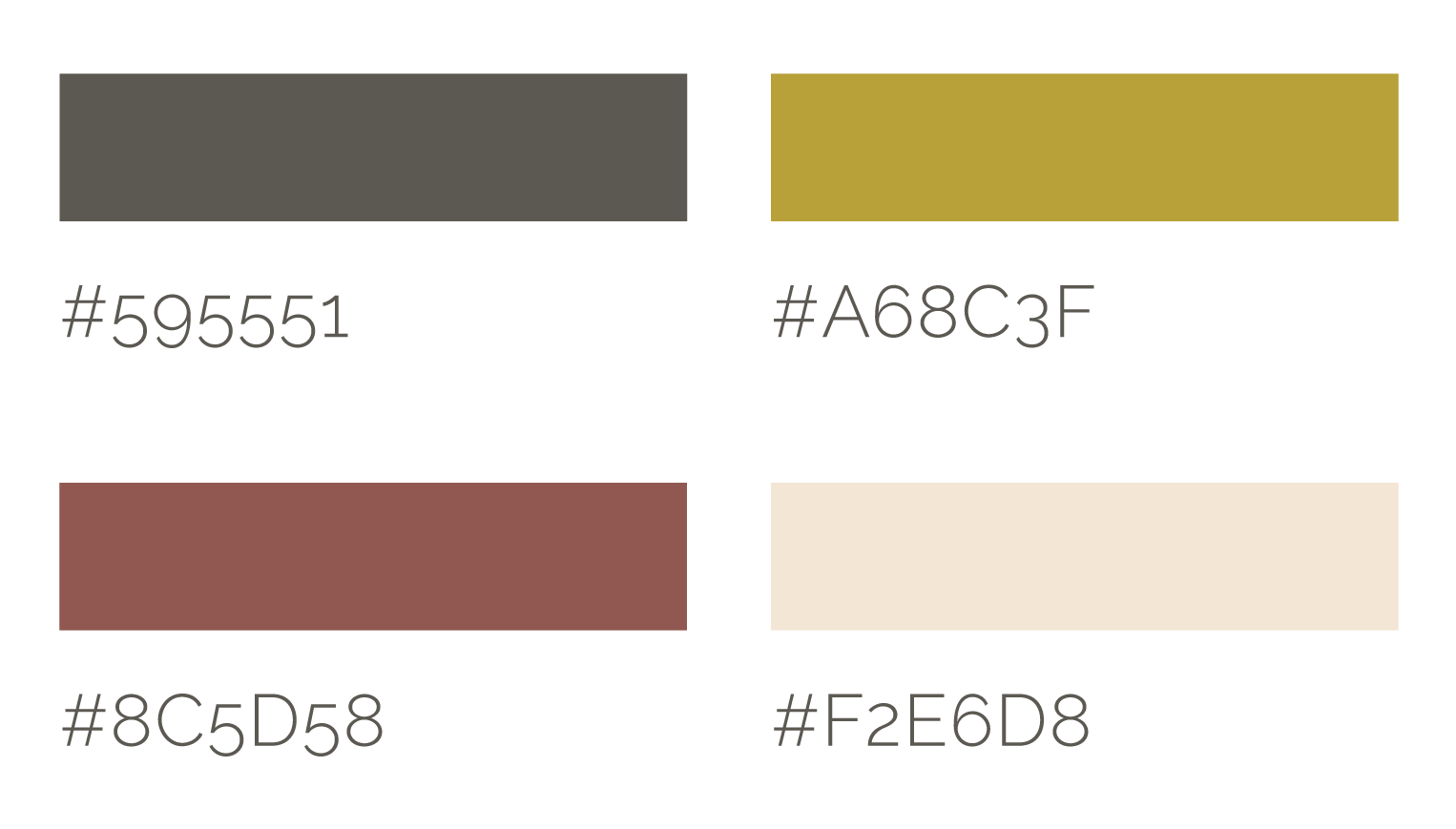
The brand identity system has one combination logo and one logo lock-up, four main colors, 10 icon designs, and two different typefaces to create a texture.
RESEARCH
Proto-persona plays a role in the design, to identify what the audience is in need of, then create it accordingly.
COMPARATIVE ASSESSMENT
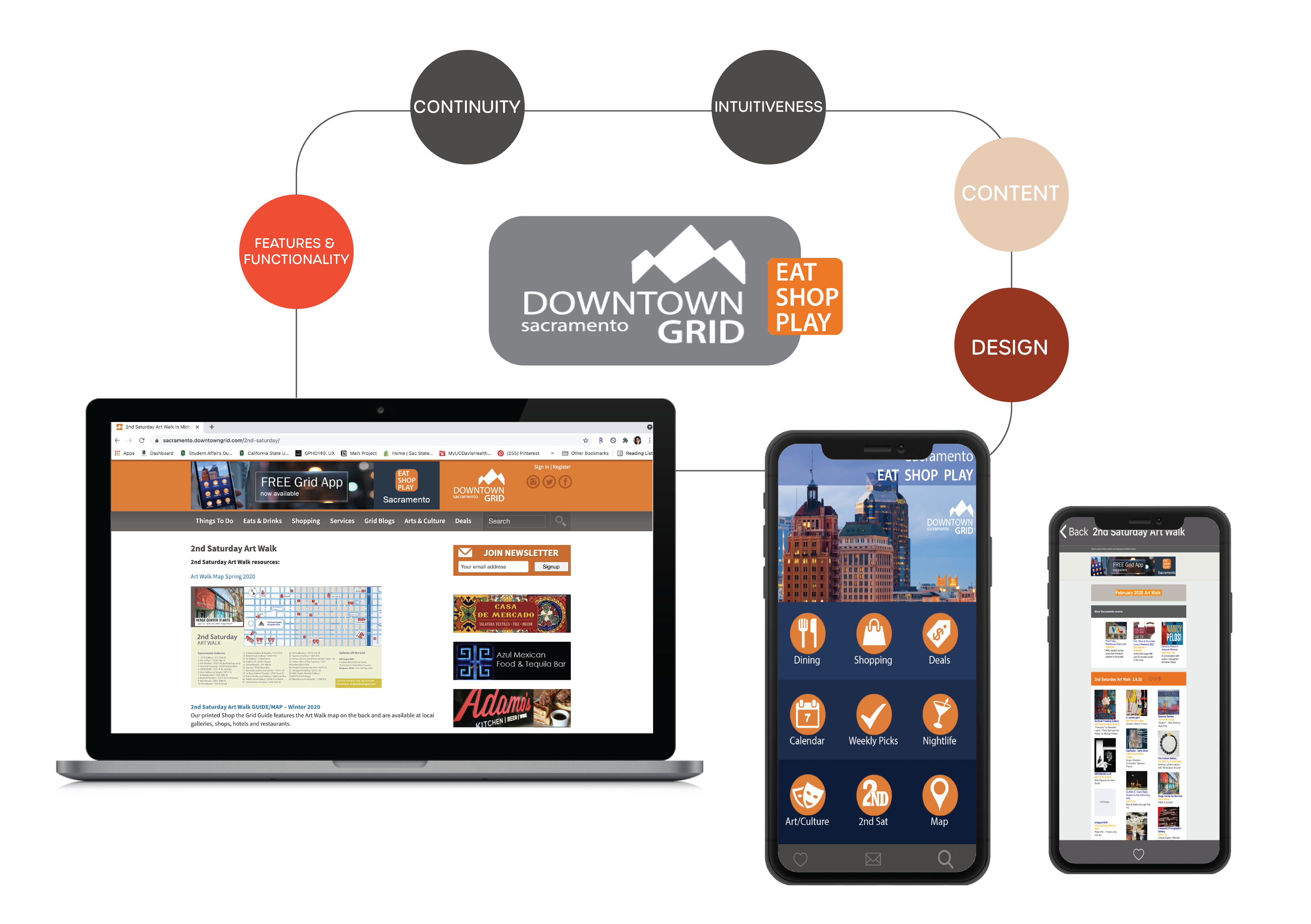
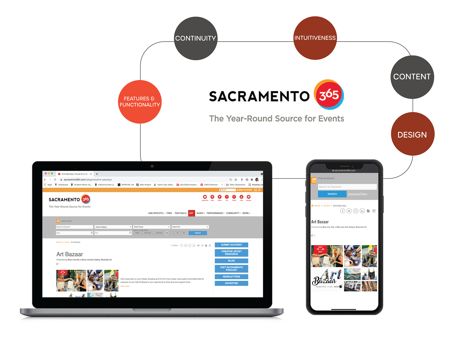
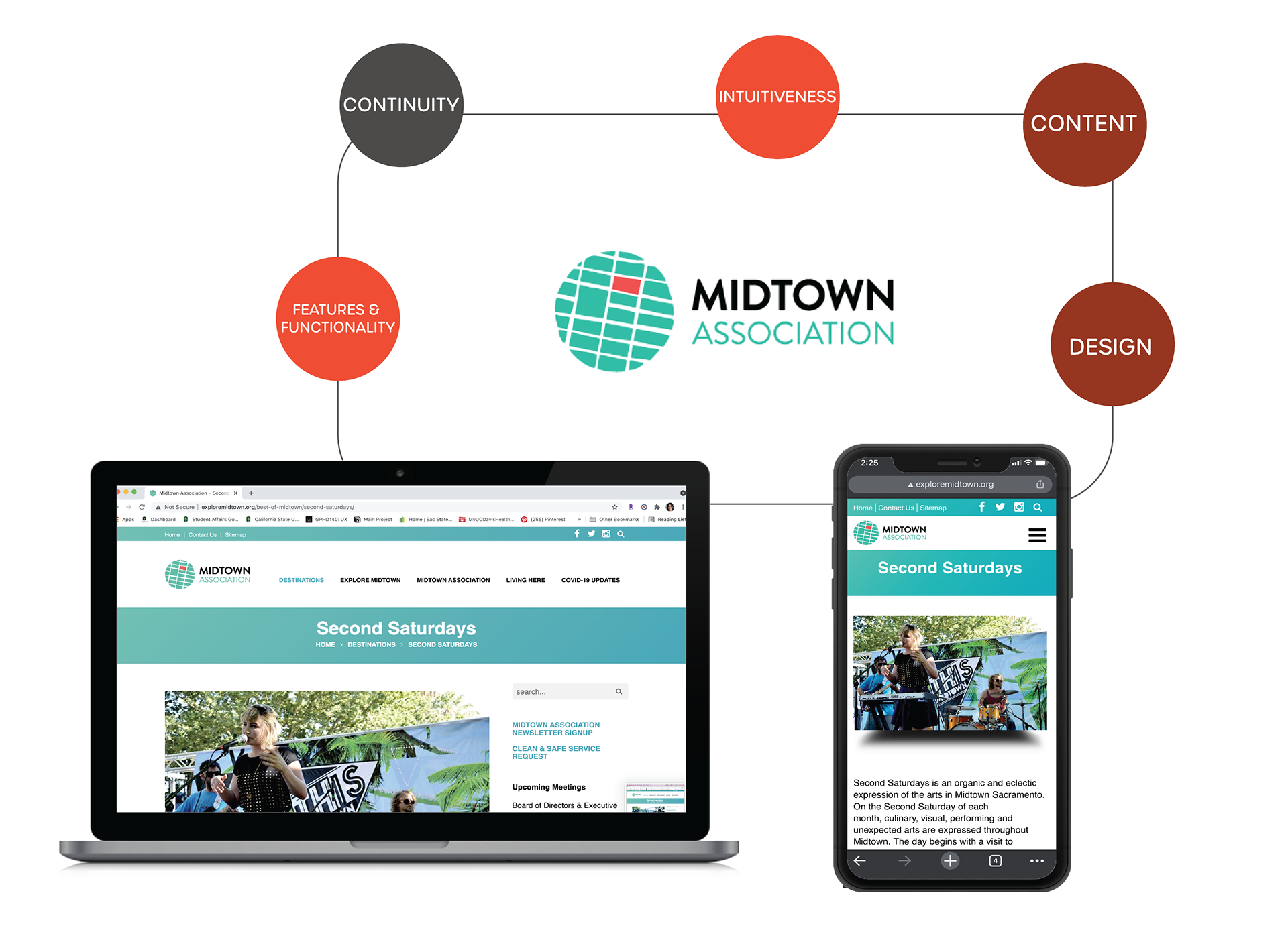
There are no current art walk apps so my comparative assessment was on websites with information about art events.
LANDING PAGE
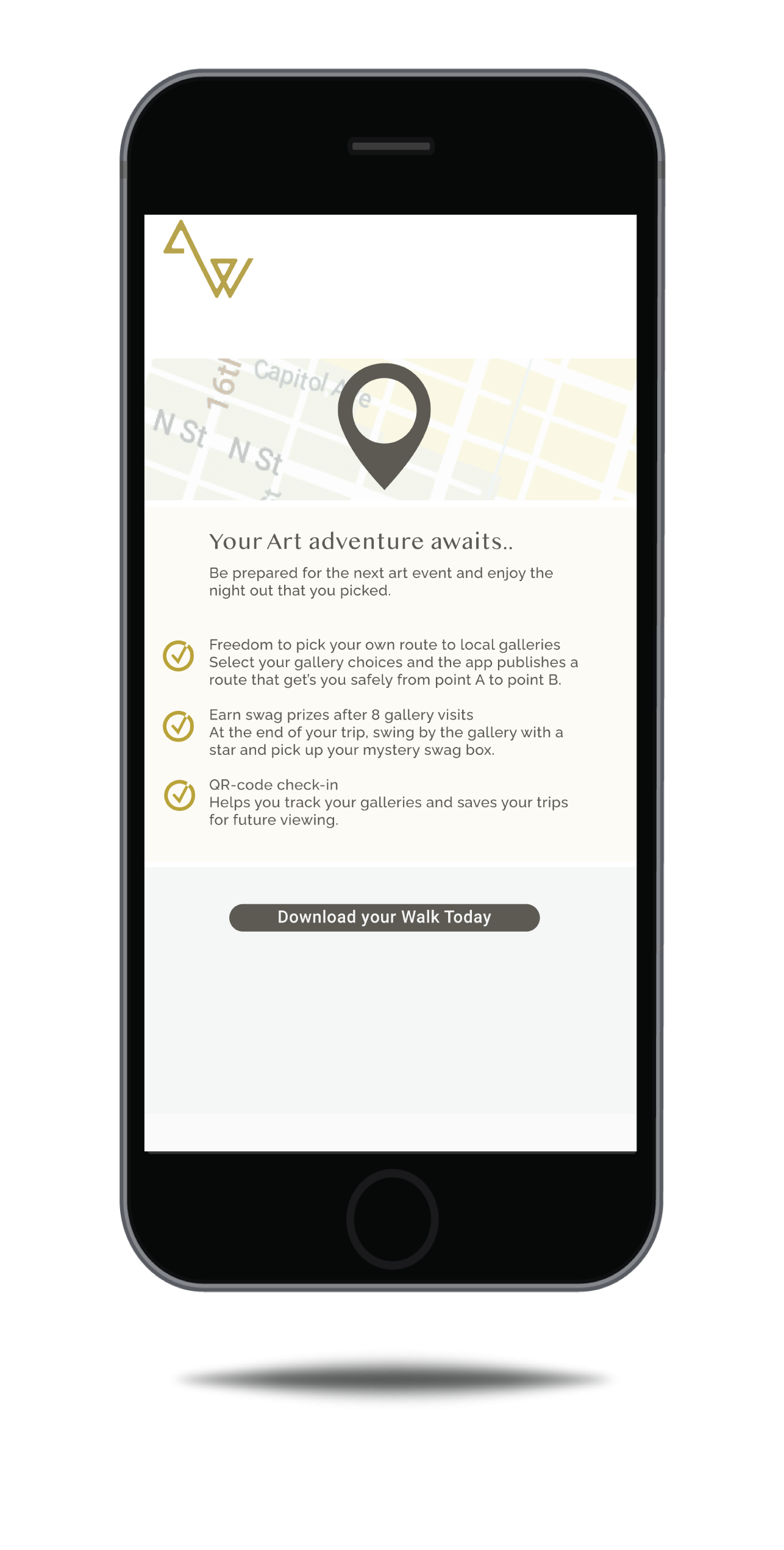
The Landing Page is designed to introduce the “app” function and give direction to the guest through the call to action, Download This App Now.
NURTURE CAMPAIGN
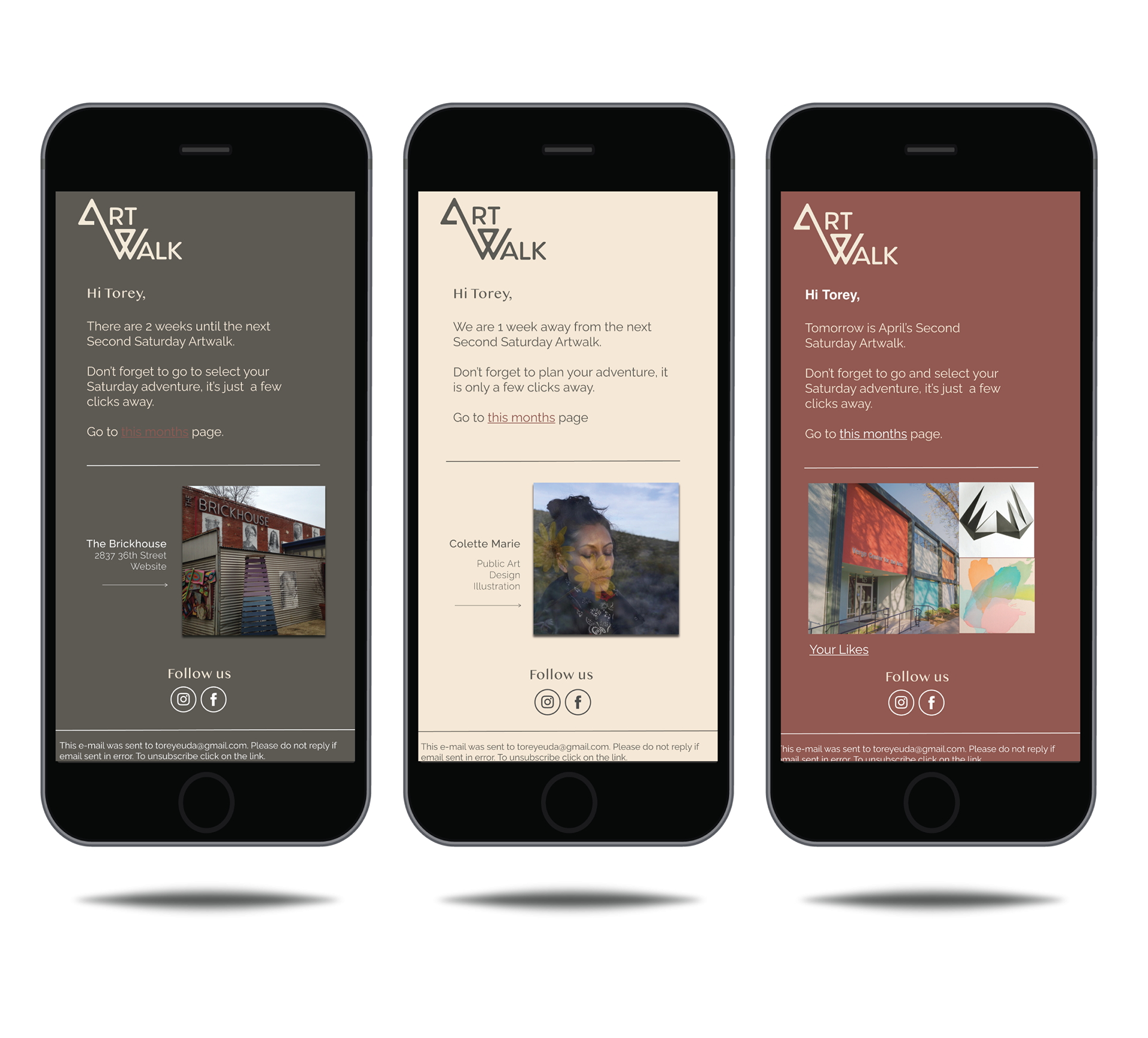
Nurture campaigns are designed to remind the guest to use their app efficiently without invoking a sense of panic, but the ease of use.
PLANNING
Workflow
To begin the process of design, there should be a pathway of success through a workflow diagram. There will be notable action buttons and item buttons to begin the low-fi wireframes.
Low-Fi Wireframes
APP DESIGN
Animation
Simple load animation when the map is being published.

Loading Page Animation
Loading Page
MEMBERS SWAG
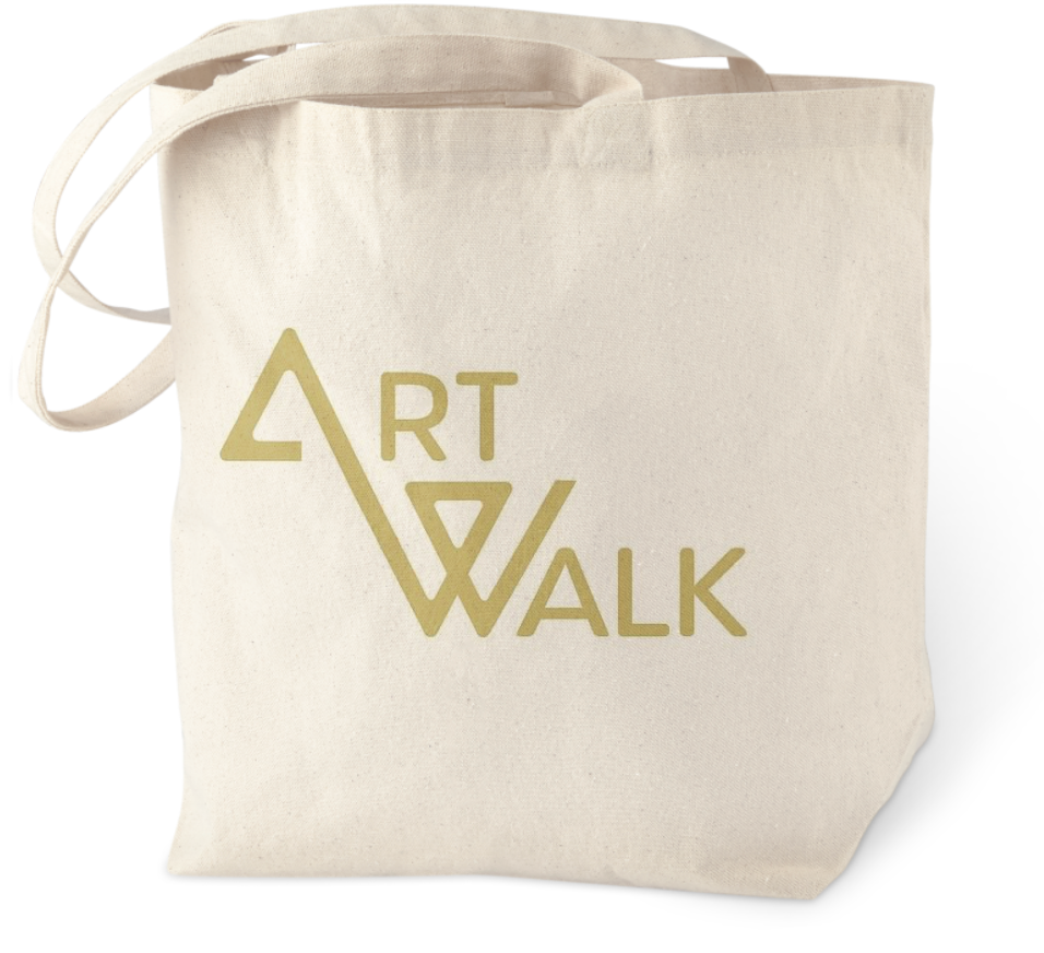
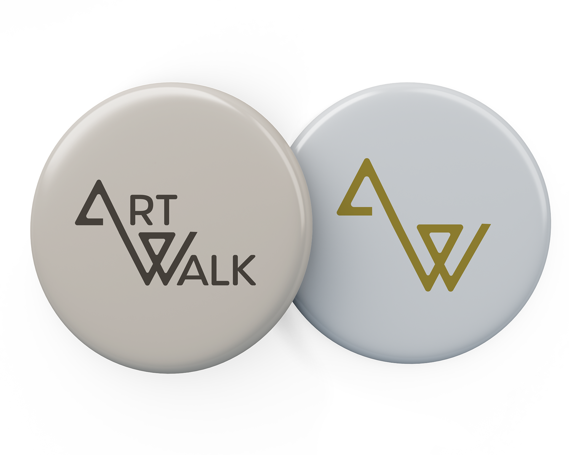
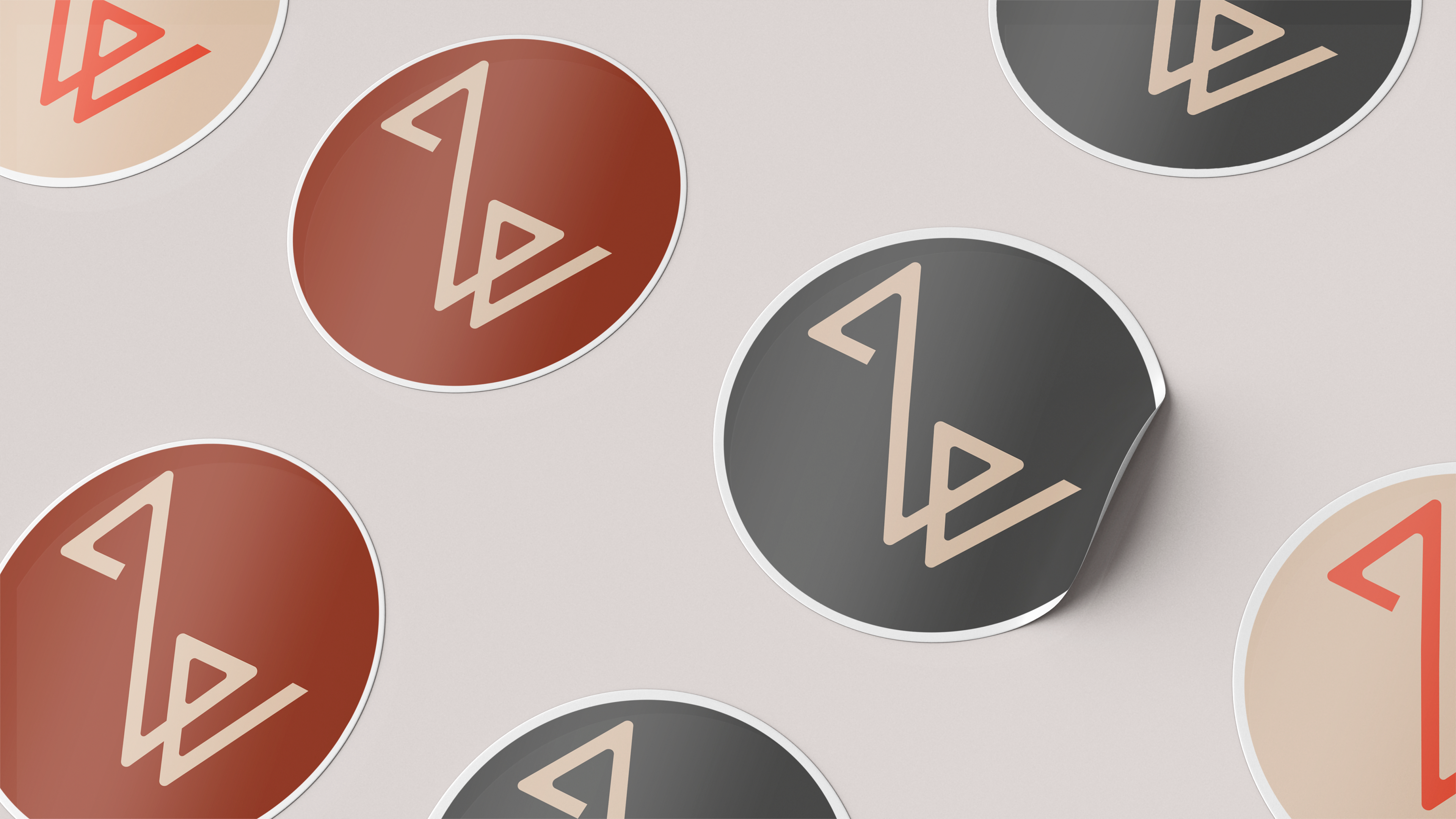
To entice membership, there is swag to be sent out with a 6-month membership in the form of your pick of stickers, tote-bag, or pin.
