SACRAMENTO
PUBLIC LIBRARY REBRAND
ABOUT
Take an existing brand identity and improve the business in its entirety.
APPROACH
This project first started with research, mood boards, and brand development: logo, typography, color palette, and patterns. Once those were established: systems development; business cards, letterheads, envelope, marketing (e-mail, brochure), environment (signage), social media, apparel, and library card. A group effort, I will highlight my input and efforts, while still attempting to show the entire process and all of its glory.
BRAND
The brand identity starts with primary, outlined alternatives, and nickname lock-ups.
TYPOGRAPHY
The typography is used to develop a cohesive look: the strong boldness of
BRANDON GROTESQUE and the body copy qualities of SOURCE SERIF.
COLOR PALETTE
The color palette inspires resourcefulness and community institution.
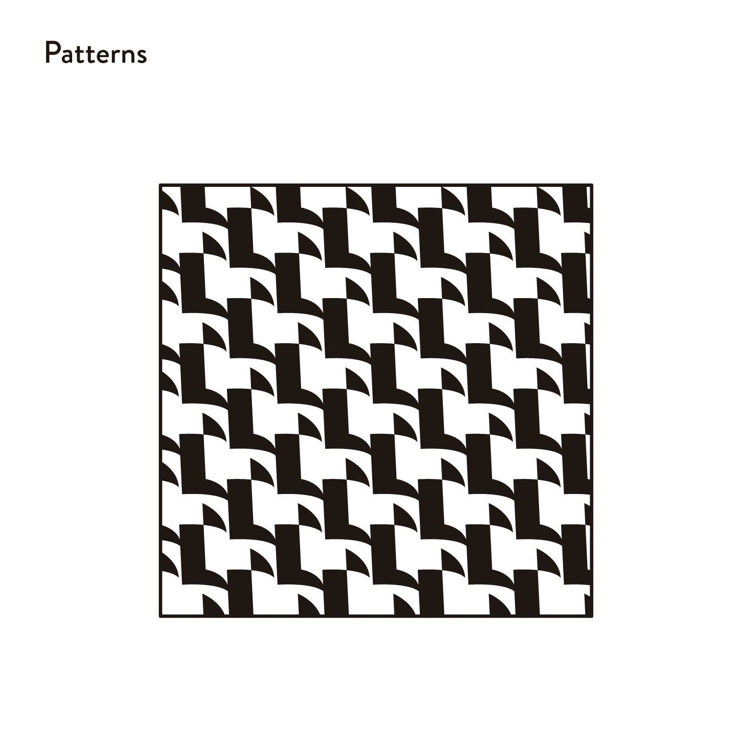
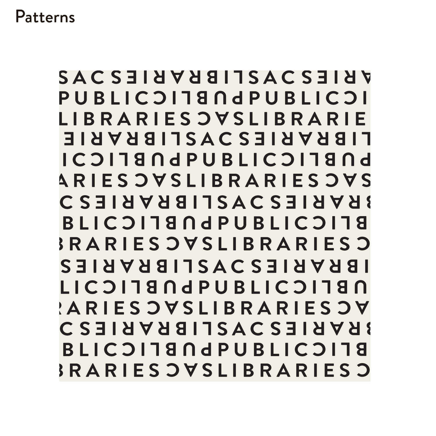
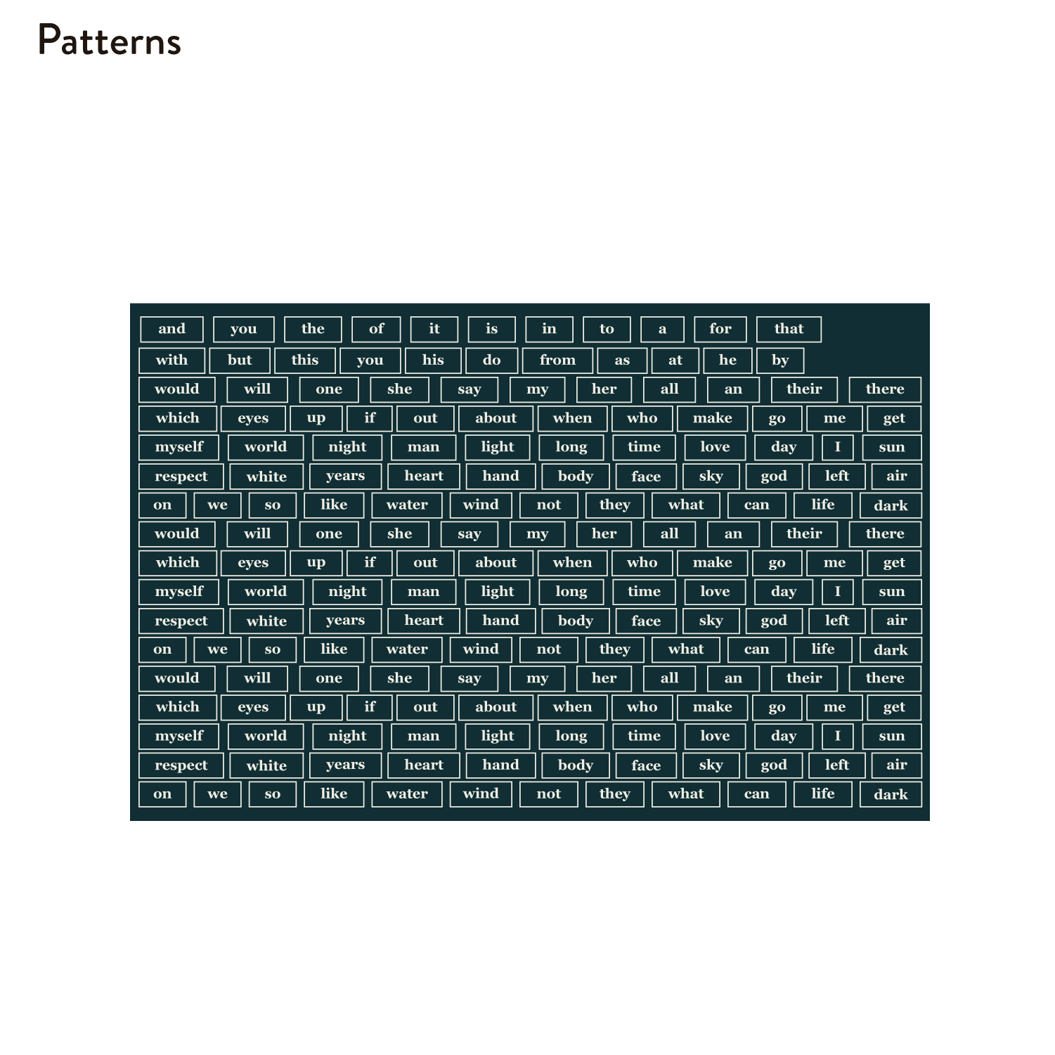
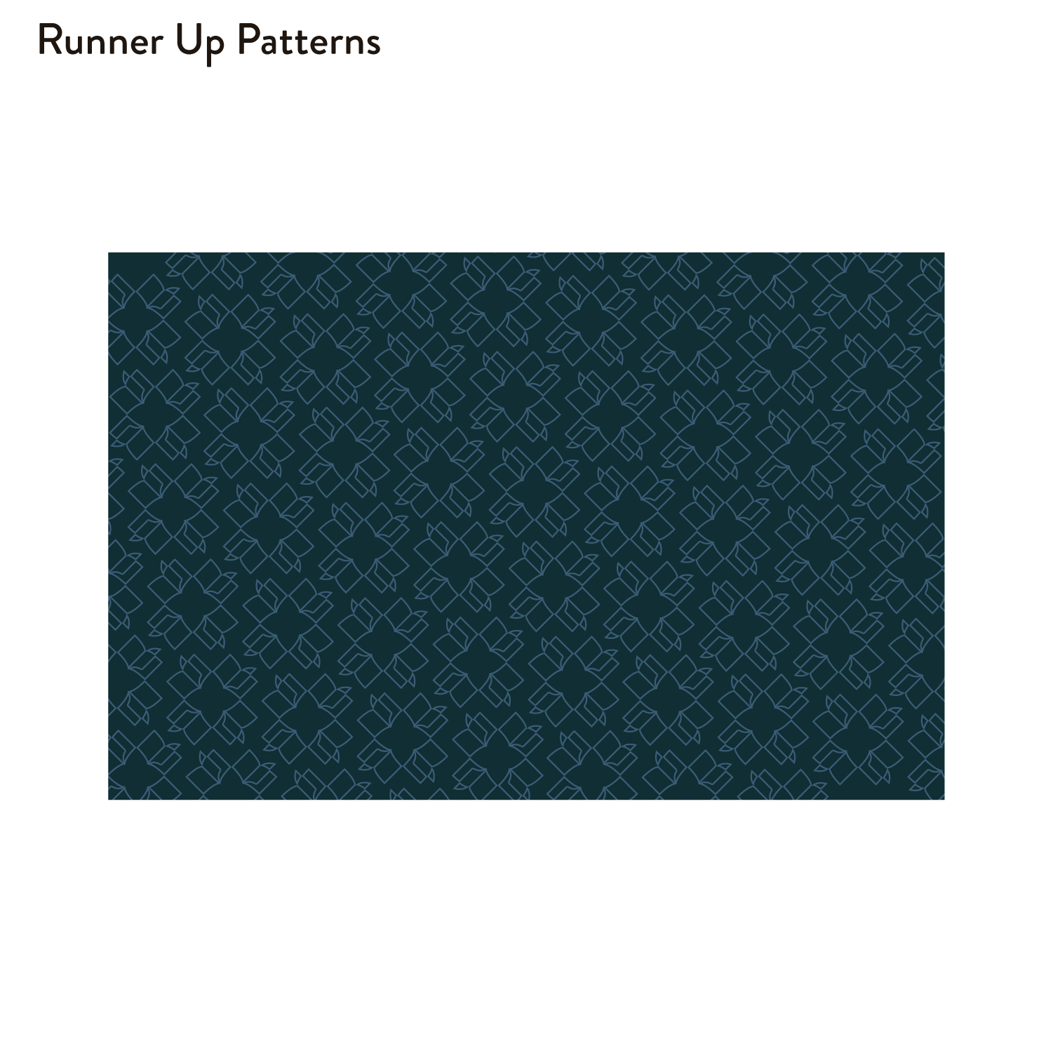
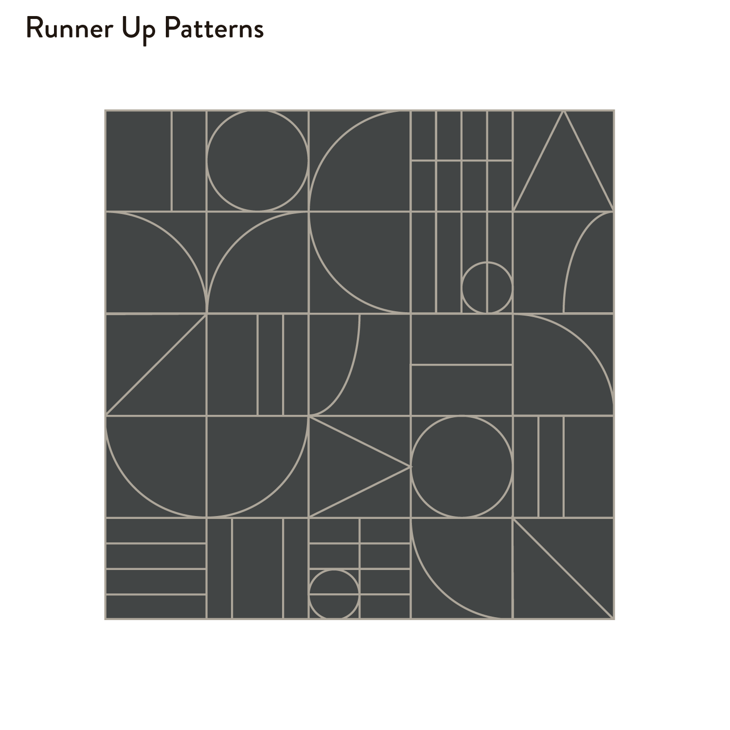
PATTERNS



STATIONERY
MARKETING
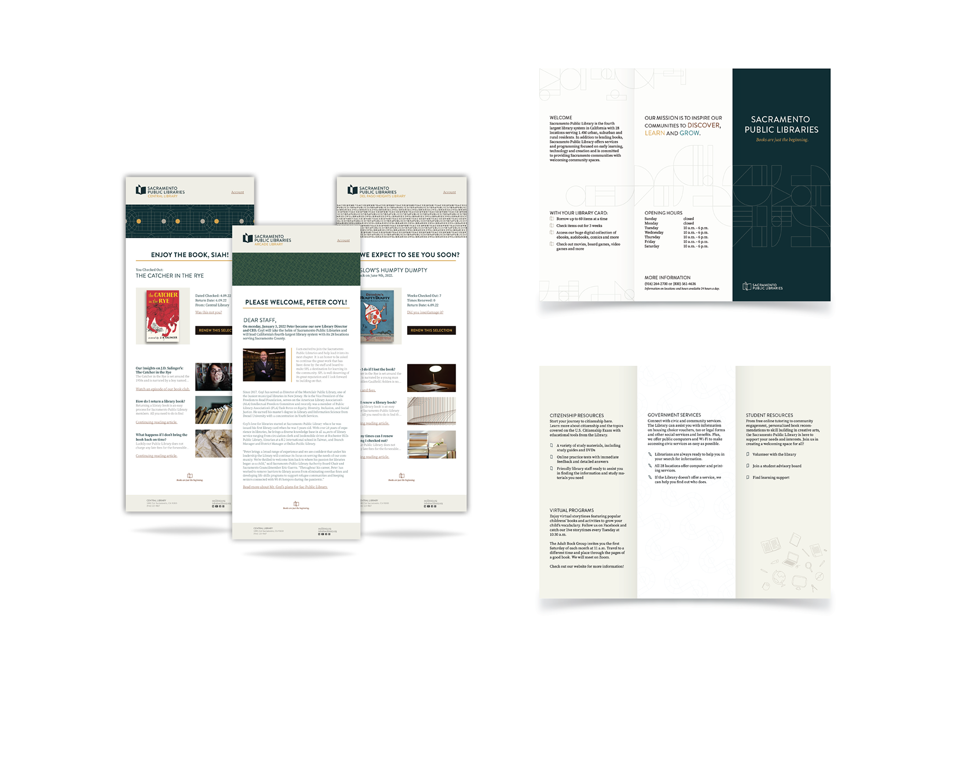
We created an e-mail campaign and a tri-fold informational flyer. View our use of patterns, typography, and color palette to bring the systems into play.
ENVIRONMENT
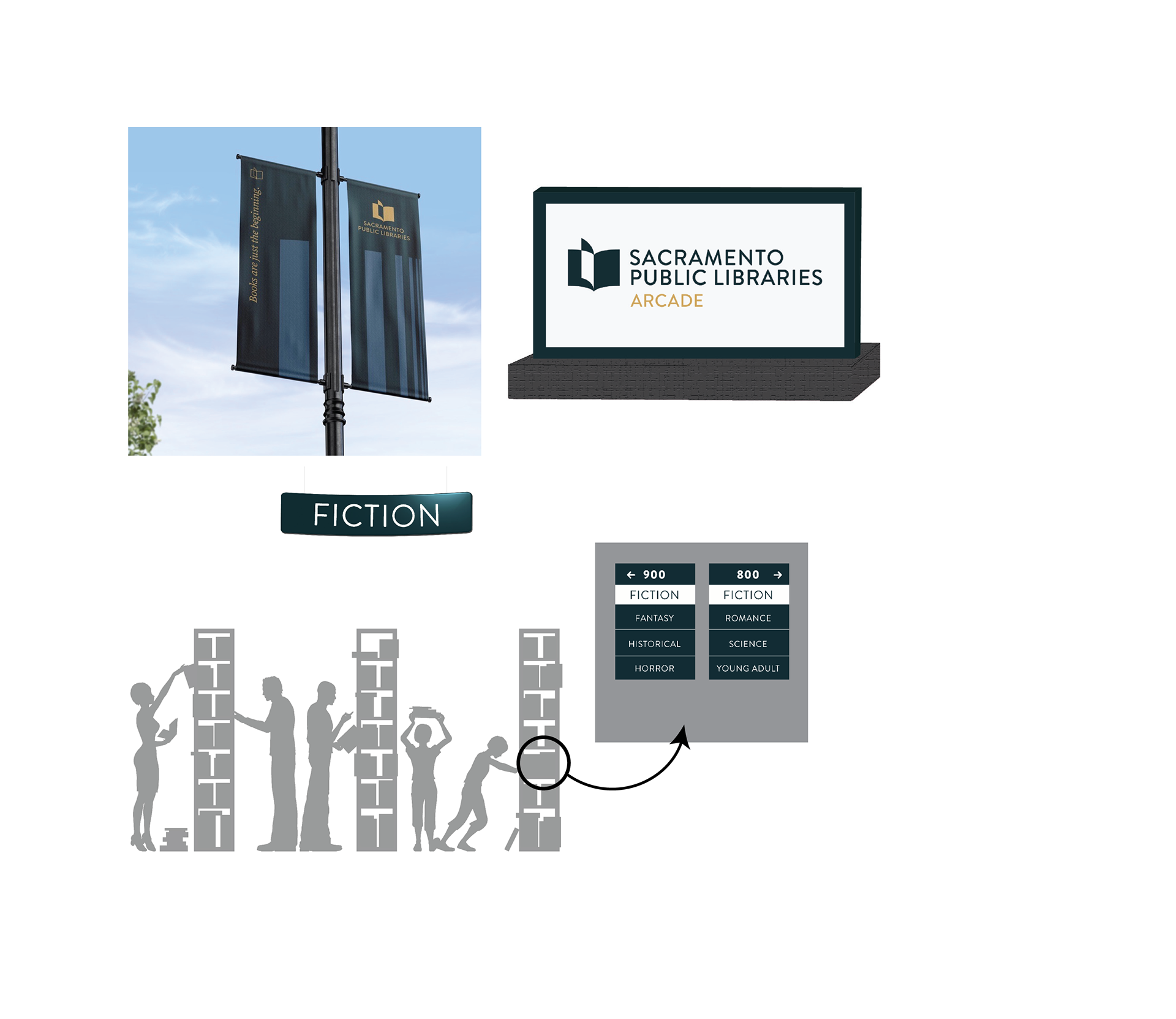
Banners, monuments, and interior, and exterior signage are important to create a visual unity across the brand identity.
SOCIAL MEDIA
Social media creates awareness and a relationship with the guest.
APPAREL
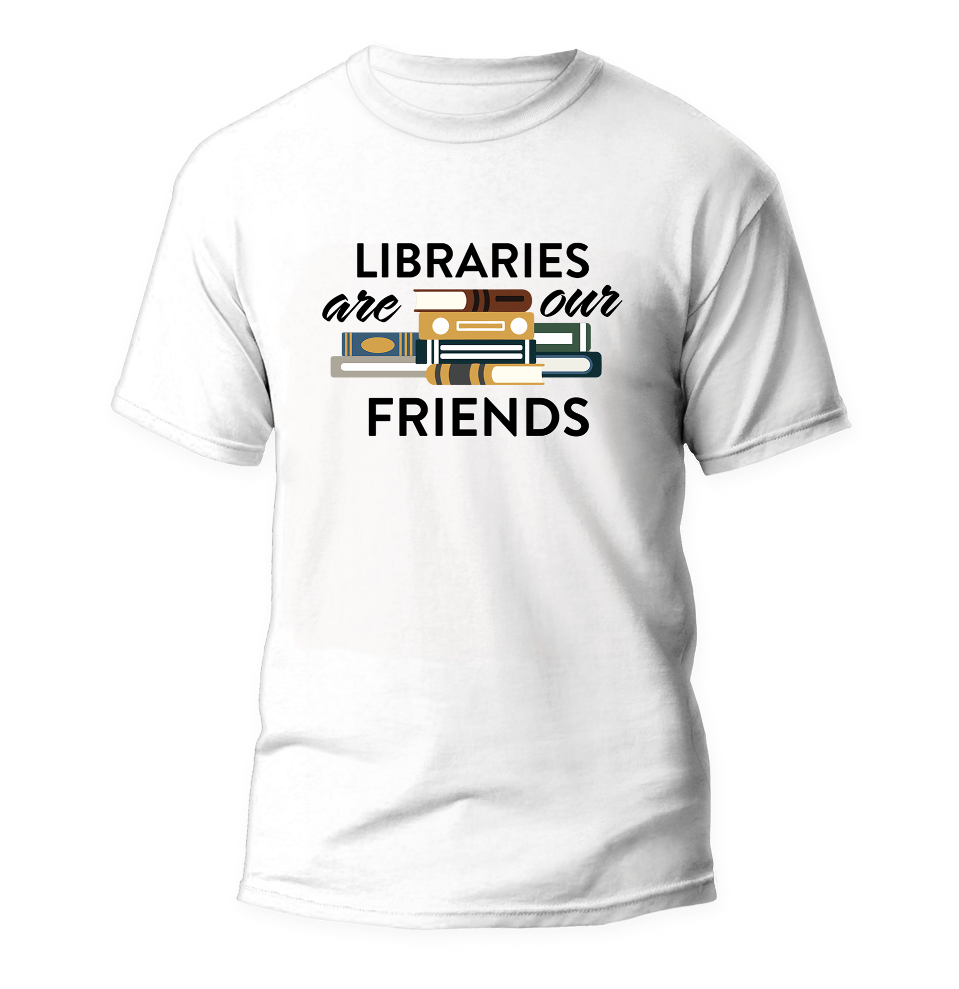
Apparel is one of the most effective outreach items and creates a relationship
LIBRARY CARD
